Perhaps the most common type of dynamic effect you’ll want to perform on one or more elements is the simple act of showing or hiding them. We’ll get to more fancy animations in a bit, but sometimes you just want to keep it simple and pop elements into existence or make them instantly vanish!
The methods for showing and hiding elements are pretty much what you’d expect: show(), to show the elements in a jQuery object, and hide(), to hide them. We’re going to delay presenting their formal syntax for reasons that will become clear in a bit; for now, let’s concentrate on using these methods with no arguments.
As simple as these methods may seem, you should keep a few things in mind. First, jQuery hides elements by changing their style.display property to none. If an element in the set of matched elements is already hidden, it will remain hidden but will still be returned for chaining. For example, suppose you have the following HTML fragment:
<div style="display: none;">This will start hidden</div>
<div>This will start shown</div>
If you write
$('div').hide().addClass('fun');you’ll end up with the following result:
<div style="display: none;" class="fun">This will start hidden</div>
<div style="display: none;" class="fun">This will start shown</div>
Note that even though the first element was already hidden, it remains part of the matched set and takes part in the remainder of the method chain. This is confirmed by the fact that both elements possess the class fun after the statement is executed.
The second point to keep in mind is that jQuery shows objects by changing the display property from none to either block or inline. Which of these values is chosen is based on whether a previously specified explicit value was set for the element or not. If the value was explicit, it’s remembered and reverted. Otherwise it’s based on the default state of the display property for the target element type. For example, div elements will have their display property set to block, whereas a span element’s display property will be set to inline.
Note
Until versions 1.11.0 and 2.1.0 of jQuery, this mechanism had a bug. After the first call to hide(), jQuery stored the old value of the display property internally in a variable. Then, when the show() method was called, jQuery restored this value. Therefore, if after the first call to hide(), the display property was set to something else, when the show() method was executed jQuery restored the old value and not the changed one.
Now that you know how these methods behave, let’s see how you can work with them.
Implementing a collapsible “module”
You’re no doubt familiar with websites that present various pieces of information in configurable modules (sometimes referred to as tiles) or some sort of dashboard page. This kind of website lets you configure much about how the page is presented, including moving the modules around, expanding them to full-page size, and even removing them completely. Many of them also provide a nice feature: the ability to roll up a module into its caption bar so that it takes up less space, without having to remove it from the page. This seems a perfect example of a functionality that you can replicate by using the knowledge acquired in the previous section. Thus, what you’re going to do is create dashboard modules that allow users to roll up a module into its caption bar.
Before delving into writing code, let’s see what the module will look like in its normal and rolled-up states. These states are shown in figures 8.1a and 8.1b.
Figure 8.1a. You’ll create your own dashboard modules, which consist of two parts: a bar with a caption and roll-up button (the minus sign on the top right), and a body in which data can be displayed.
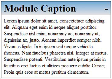
Figure 8.1b. When the roll-up button (the minus sign on the top right) is clicked, the module body disappears as if it had been rolled up into the caption bar.

In figure 8.1a, we show a module with two major sections: a caption bar and a body. The body contains the data of the module—in this case, random “Lorem ipsum” text. The more interesting caption bar contains a caption for the module and a small button (the minus sign on the top right) that you’ll instrument to invoke the roll-up (and roll-down) functionality.
Once the button is clicked, the body of the module will disappear as if it had been rolled up into the caption bar. A subsequent click will roll down the body, restoring its original appearance.
The code to implement this functionality can be found in file lesson-8/collapsible .module.take.1.html and is shown in listing 8.1. In case you surmise that the “take.1” part of this filename indicates that we’ll be revisiting this example, you’re right!
Listing 8.1. The first implementation of our collapsible module
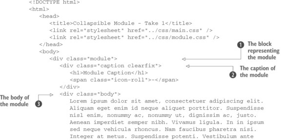
The markup that you’ll use to create the structure of your module is fairly straightforward. We’ve applied to it some class names that serve both for identification as well as for CSS styling. The entire construct is enclosed in a <div> having module as a class  , and it contains the caption
  and the body
  that are <div>s with the classes caption and body applied, respectively. The caption element has also a class called clearfix that’s used only for styling purpose, so we’re not going to discuss it.
In order to give this module the roll-up behavior, you put inside the caption a <span> having class icon-roll, containing an “icon” (actually a text with the minus sign). To this element you attach a handler for the click event  .
.
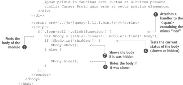
Within the click handler, you first locate the body associated with the module. You need to find the specific instance of the module body because, remember, you may have many modules on your dashboard page, so you can’t just select all elements that have the body class. You quickly locate the correct body element by finding the closest module container, and then starting from it you search for a descendant having class body  . If how the expression finds the correct element isn’t clear to you, now would be a good time to review the information in the early lessons of the app regarding finding and selecting elements.
Once the body is located, you test whether the body is hidden or visible using jQuery’s is() method  . If the body is hidden, you show it using show()
  ; otherwise, you hide it using hide()
  . That wasn’t difficult at all, was it? But as it turns out, it can be even easier!
Toggling the display state of elements
Toggling the display state of elements between revealed and hidden—as you did for the collapsible module example—is such a common occurrence that jQuery defines a method named toggle() that makes it even easier.
Let’s apply this method to the collapsible module and see how it helps to simplify the code of listing 8.1. The next listing shows only the click handler for the refactored page (no other changes are necessary) with the changes highlighted in bold. The complete page code can be found in the file lesson-8/collapsible.module.take.2 .html.
Listing 8.2. The collapsible module code, simplified with toggle()
$('.icon-roll').click(function() {
   $(this)
          .closest('.module')
          .find('.body')
          .toggle();
});
Note that you no longer need the conditional statement to determine whether to hide or show the module body; toggle() takes care of swapping the displayed state on your behalf. This allows you to simplify the code quite a bit and avoid the need to store the body reference in a variable.
The toggle() method isn’t useful only as a shortcut for alternating calls to show() and hide(), and in the next few pages you’ll discover how this method allows you to do more than that.
Instantaneously making elements appear and disappear is handy, but sometimes you want the transition to be less abrupt. Let’s see what’s available for that.
Leave a Reply